HEMA
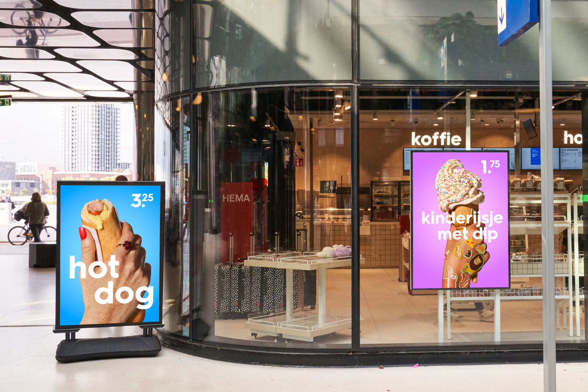
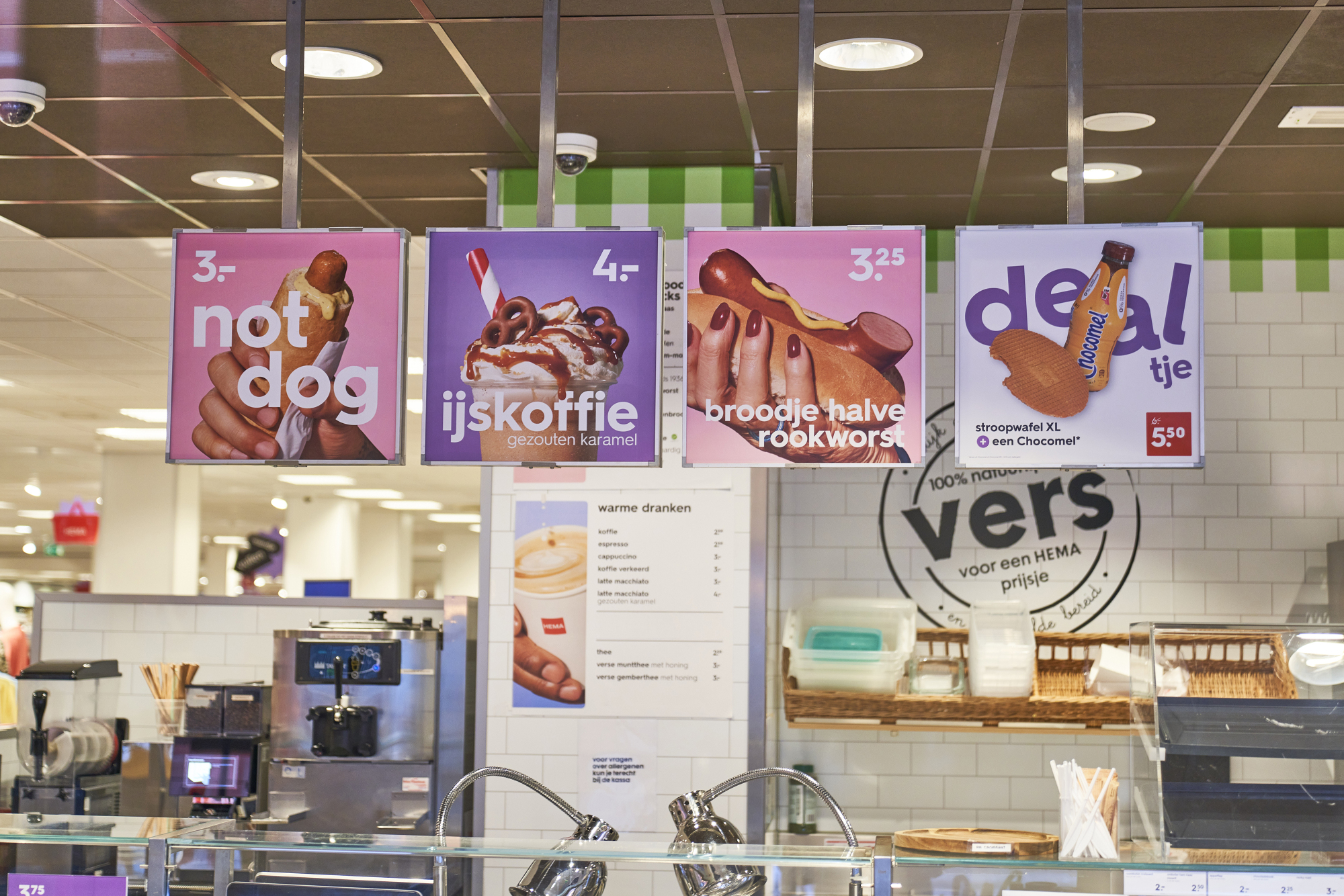
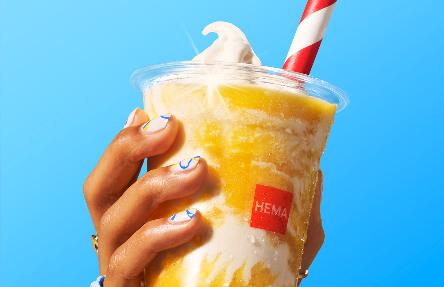
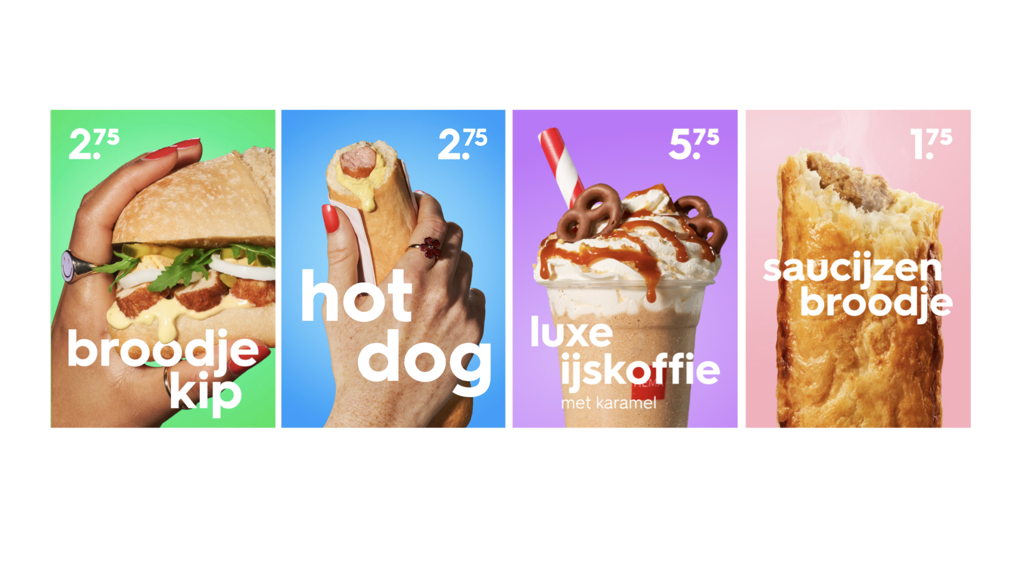
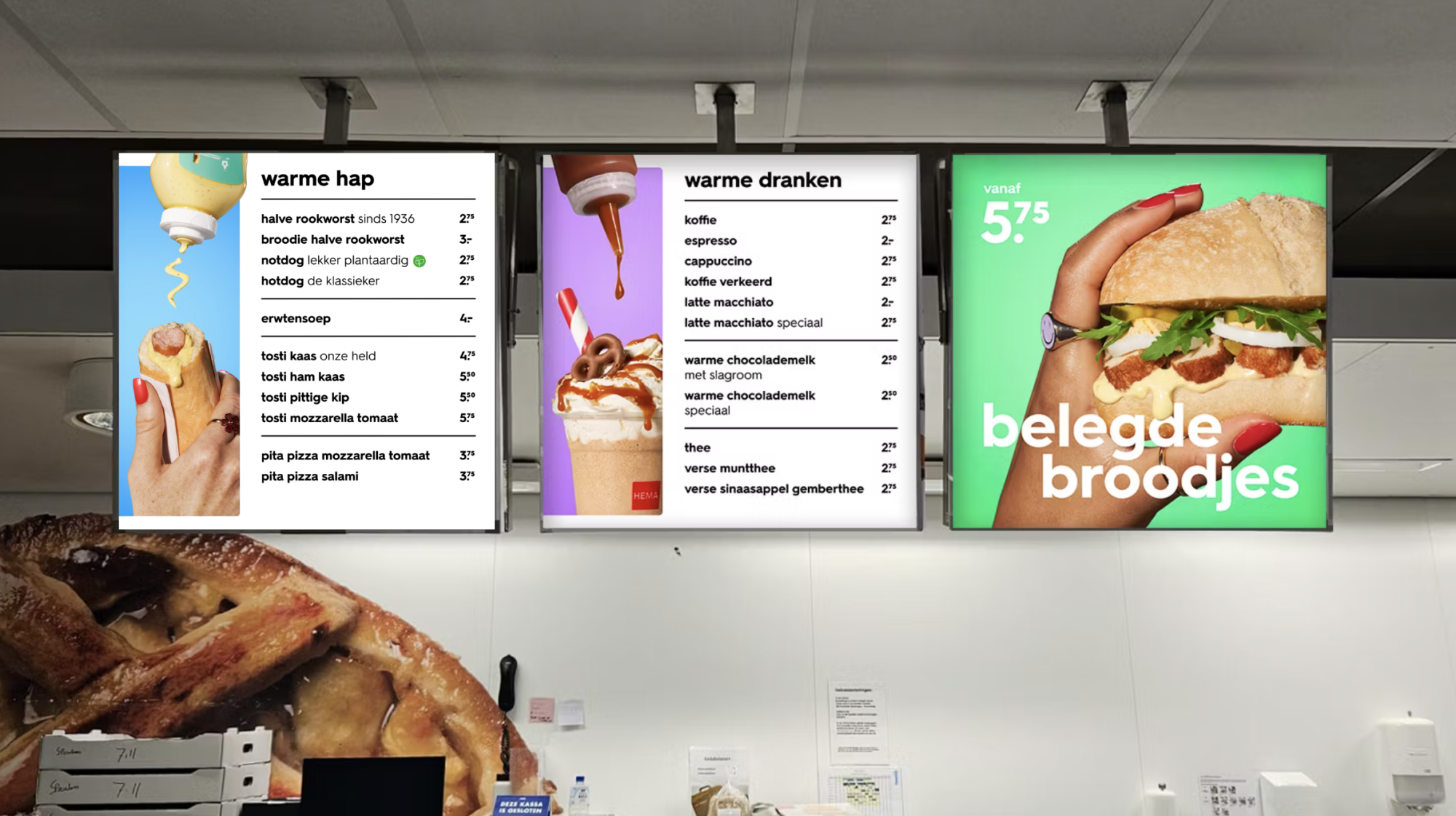
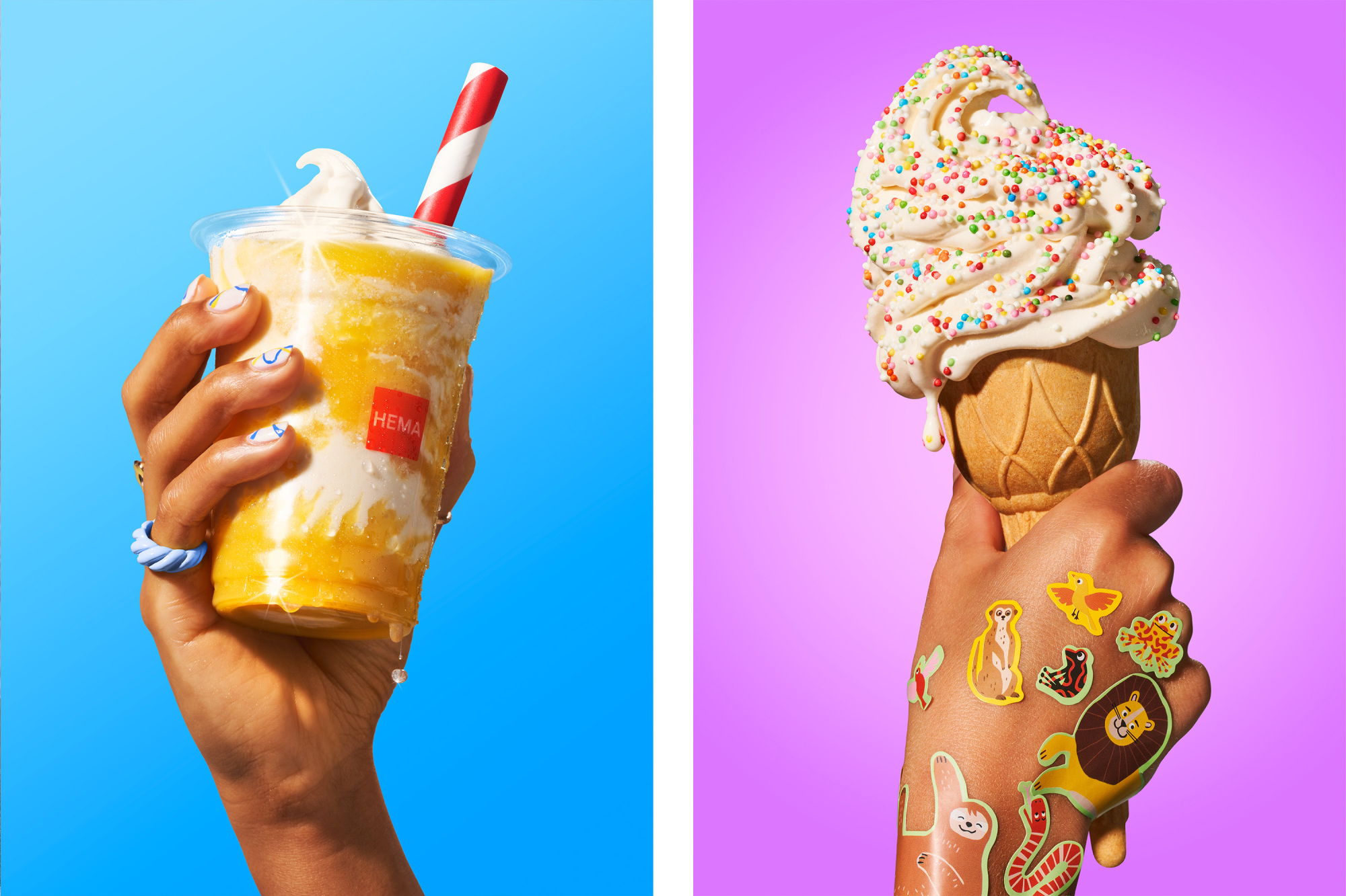
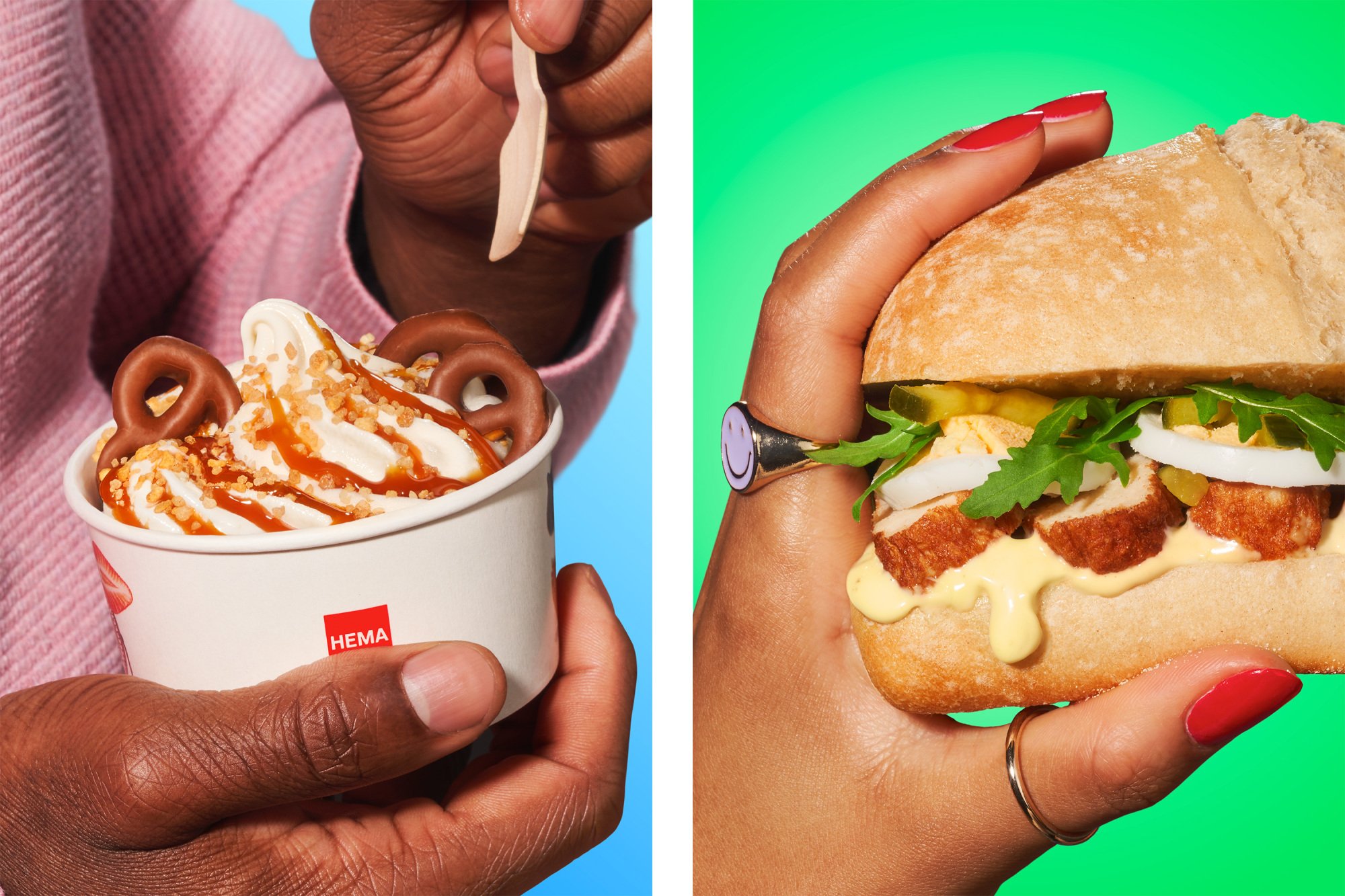
HEMA wanted a refreshed look and feel for their food photography, something that stayed true to their iconic simplicity while bringing in a bold, modern edge. We dove into the brand’s DNA and dialed up the brightness, punchy lighting, and playful details to the right balance of appetite appeal. Alongside the photography, we also designed all in-store menu assets to bring the new visual language into the physical space. The result? A cohesive, crave-worthy identity that feels unmistakably HEMA, just fresher, bolder and ready to win over a broader audience.
You can read my thoughts on the project here:
https://marketingreport.one/creation/interview-ines-bernardo-creative-director-scrambled.html